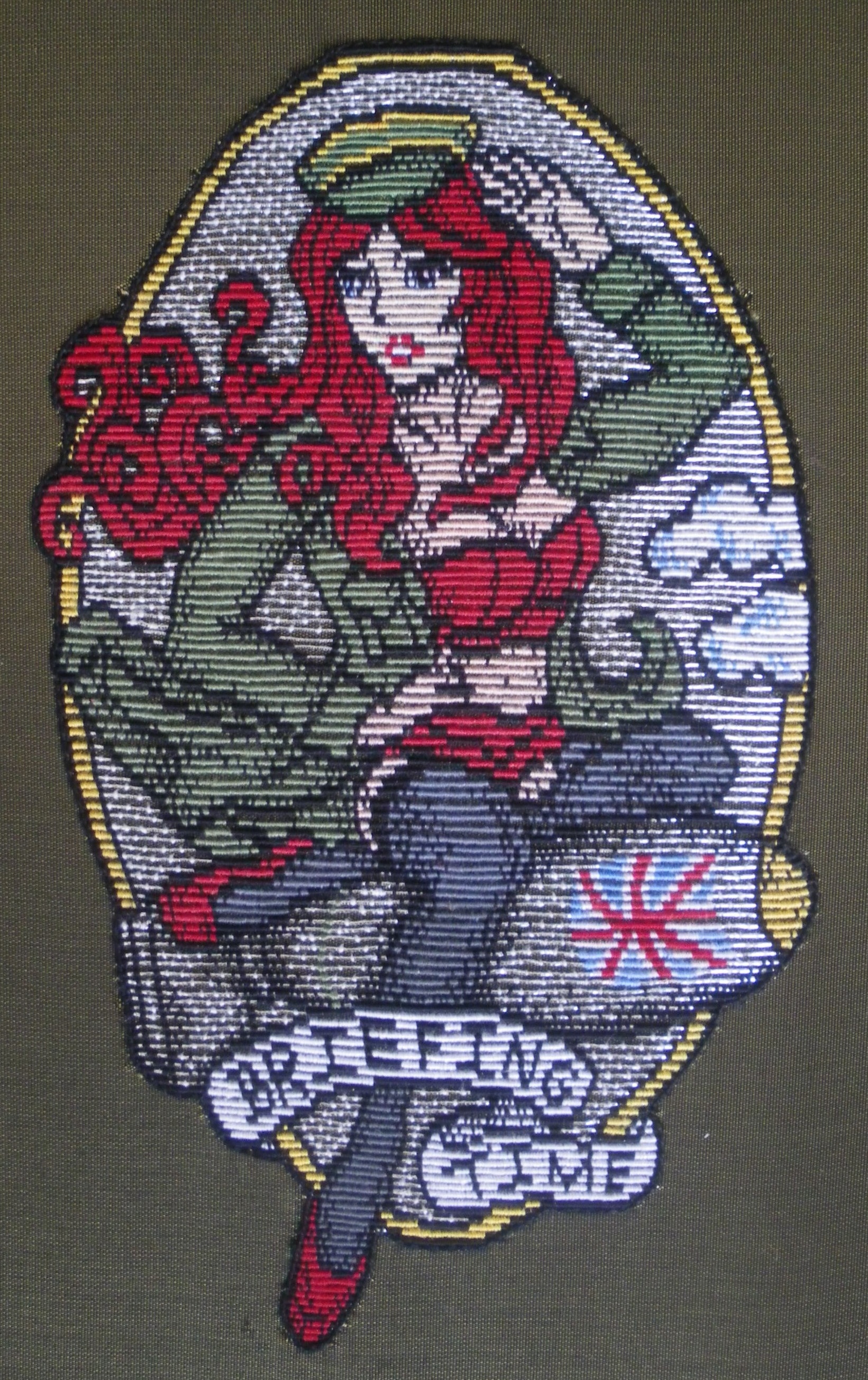
The second hand-embroidered entry in what i think is now becoming a small series, based around the concept of re-wording chocolate bar wrappers in a somewhat satiical comment on my eating disorder. I think this specific example is my favourite pun:

Chocolate manufacturers ‘Nestle’ and their white chocolate ‘Milkybar’.

This series started as an impromptu doodle but is a concept I’m enjoying exploring. The text-twisting of chocolate logos appeals to my sense of humour, and I think the best way for me to appoach a difficult topic such as this is to integrate an element of humour. I didn’t specifically set out to talk about eating disorders, or anything, really – most of my work thus far has been purely aesthetically appealing, nothing more. I don’t believe art necessarily has to have any higher purpose beyond ‘looking nice’, if that’s its’ intended outcome. For me, it’s more important to ‘do it properly’: maintaining technically impeccable stitching and an exceptionally high standard of technique.
That said, this technique-based skill-set – my ‘vocabulary’, if you like – could yet be used for more ‘meaningful’ things in the future. With the underlying issues beginning to be explored behind this series of work, I think this might represent my first foray into something more profound.

As usual: cotton background with white padded PVC applique, individual letters padded up and couched over with double strands of blue metallic passing thread. Highlights on blue letters worked in concentrated couching (or nue) in a lighter blue.


awesome work, like it very much , well done!!!